10 Mobile Responsive Mistakes that will Change your Perspective on Responsiveness

So, I’m back with this topic as I promised in my previous blog “Top 3 Things that you are missing out when your Site is Not Mobile Responsive”. I hope, now you know the importance of making your website mobile responsive. Making a website responsive is never a ‘walk-down-the-hill ‘task. It takes both time and effort to pull-off something like this like a pro. I think you will agree with me when I say that you are bound to make some mistakes while trying to make a website mobile responsive. You have a long list to consider and its human nature to make mistakes. I’m writing this post to throw light on some of these mistakes that should be kept at when developing a mobile responsive website.
So, let’s dig deep into this list & develop awesome mobile responsive websites:
1. Websites with Blocked JavaScript, CSS & Media Files:
‘Mobile responsive CSS’ seems to be the buzzword, these days. For ideal fetching and rendering, it’s imperative that Google is given access to all the CSS, javascript and media files within your site. The activity of Google’s crawler in your site is governed by many factors like tags (canonical, noindex, noodp etc), robots.txt, protocols etc. Among these, robots.txt is the supreme factor that the respective crawlers consider beforehand. Many of the webmasters seems to block CSS and Javascript files using robots.txt. This is something that can lead to unclear or incomplete fetching and indexing of the pages in your site. So, even when the desktop view of your site with such glitch might seem perfect, it’s the mobile view that is going to hurt your eyes.
Points to ponder:
- Ensure that Google sees your site as you want it to, by using, Fetch as Google tool in the Google’s Search Console.
- You can also use the robot.txt Tester tool in Search Console to check whether the robots.txt file of your site blocks any CSS or Javascript
- Mobile Friendly Test Tool by Google is another means of checking whether your site is mobile responsive. You can find the mobile responsive test results from this tool for a mobile responsive site compared against a non mobile responsive site here.

Like this Tip?Click Here to Tweet It
2. Unplayable or Badly Optimized Content :
One of the other mistakes that webmasters make while making a mobile responsive website is ignoring the videos. The mobile devices of today do not support all type of video formats, related players etc. Mobile visitors, upon landing on your site can easily get annoyed and exit, if any type of content is not supported.
Points to ponder:
- When structuring animations, always, see that you adhere to the HTML5 coding standards to cater enhanced user experience.
- It’s wise to use HTTP Live Streaming (HLS). HTTP Live Streaming is a media based protocol launched by Apple Inc, according to HLS, the video in your site is stored as chunks of downloadable HTTP files and each chunk responds to different bit rates, therefore, a video which plays without interruption with respect to the available bit rate is always given preference.
- Make sure that size the videos in the best possible manner. Make sure that the videos don’t overflow containers. You have sources like Flowplayer that can assist you in adapting screen size to video size.

Like this Tip?Click Here to Tweet It
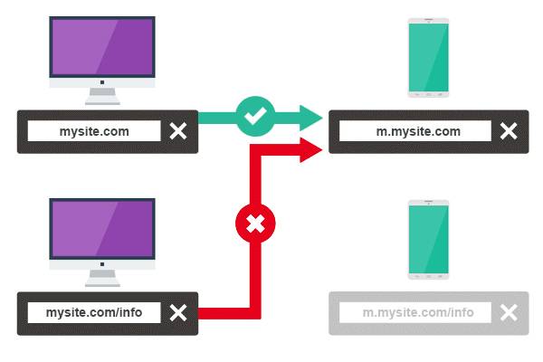
3. Irrelevantly Redirected Mobile-specificURLs:
Making a website mobile responsive is an uphill task. Lately, webmasters sorted out special means to keep websites responsive on mobile devices and that is by using separate URLs for the mobile and desktop versions of the same website. Maintaining mobile-specific URLs is still regarded as a debatable topic. However, you can see lots of websites which have already adopted this strategy. You are bound to feel like a pro if you have achieved this already, but, Are you sure that it’s done immaculately? A common mistake that webmasters tend to make while maintaining mobile specific URLs for their site is faulty redirects.
It is inevitable that you redirect the desktop URLs of your site to corresponding mobile-specific URLs. If this is not take care of, you are bound to face stripped off rank value by Google or you can even face issues like duplicate content.
Points to ponder:
- If you have a verified Search Console account, Google notifies you of any faulty redirects on your site. You can find the faulty redirects in Search Console-> Crawl->Crawl Errors. All the fault redirects will be listed in the tab under ‘smartphone’ in this page.
- Configure your server in such a manner that it redirects all the desktop URLs to mobile-specific URLs upon performing searches on mobile devices.
- Utilize tags like canonical tags if you want to assign the credit of visit to a mobile-specific URL or desktop URL.
Like this Tip?Click Here to Tweet It
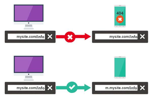
4. Failing to Handle 404s in Mobile Devices:
Keep close tabs on all your mobile and desktop URLs, make it a point to test all the mobile URLs against equivalent desktop URLs and ensure that there are not faulty redirects. On some occasions, you can observe that a desktop URL which loads fine on the respective device rendering a 404 page in mobile devices. This is something that you see often with websites which has mobile-specific URLs. This is to be avoided at any cost, make it a point to redirect the desktop URL of the website to relevant mobile specific URL to avoid 404 errors in the mobile version.
Points to ponder:
- Search for notifications on mobile only 404 errors on Google Search Console.
- When using dynamic serving, ensure that the user-agent detection is configured in the right way.
- Perform a consistent check on crawl error report using any website analysis tool or Search Console.
Like this Tip?Click Here to Tweet It
5. Ignoring Slow Mobile Pages:
Most of the mobile website webmasters ignores or forgets to optimize their mobile website for page speed. This is literally a critical flaw that’s easily underestimated. Users can always get annoyed if they are supposed to wait for ages for your content to load.
Today, you have several website speed checker tools; I personally prefer the page speed tool from Google: Google PageSpeed Insights which returns page speed test results for both mobile and desktop versions of your website. Given below is an ideal page speed test result.
Points to ponder:
While optimizing your mobile pages for speed, it is essential to factor-in aspects like the different types of bandwidth availability for the mobile users and it is always wise to optimize the page speeds keeping in mind the lowest available bandwidth speed.
- Make it a point to optimize the javascript codes, it would be wise to alleviate aspects like long javascript snippets as these can easily block browser from indexing and returning the page.
- Optimize the CSS in such a manner that it can be executed as easily and quick as possible when a page is being loaded.
Like this Tip?Click Here to Tweet It
6. Hiding your Content from Users:
It is a well known fact that Google values valuable content which complies by the user query more than anything. When optimizing websites for mobile, most of the webmasters opt to strip-off content from the mobile version, to make the site architecture blend-in with the mobile devices. On some occasions, it becomes a necessity to strip off or add content to the mobile version, under such circumstances; there are some standards you need to follow to notify the crawlers about the disparity in content on the mobile and desktop versions of the website. This will help you to keep concerns like cloaking or hidden content at bay.
Points to ponder:
- Utilize dynamic serving to notify the Google crawler for smartphone to crawl the page and index the mobile content.
- Always make sure that the user-agent is rightly sorted out, literally transformed, don’t mistake a mobile user-agent with a desktop user-agent and vice versa.
- Choose the right webfont and structure the content in such a manner that it does not get clutter when squeezed into relatively smaller screens.
Like this Tip?Click Here to Tweet It
7.Understanding the mobile devices but failing to set the break points:
Webmasters, who realizes the inevitability of mobile responsiveness, tend to perform a detailed study on mobile devices. However, when it comes to putting this to practice they make some minor errors like failing to set the break points with respect to device dimensions. Failing to set breakpoints wherever necessary breaks-up the content alignment in mobile devices and this point to bad user experience and page exits.
Points to ponder:
- It’s always wise to work your way up, literally transformed, optimize the contents for the mobile device with small screen resolution and work your way up. Such a strategy will allow you to identify the right spot to use the breakpoints.
- One of the other best practices to set breakpoint is to let the content in your site decide the breakpoints within the mobile friendly architecture.
Like this Tip?Click Here to Tweet It
8. Forgetting about Touch
Almost of the digital mobile devices of today are touch enabled, masterminds are even putting in lots of efforts to make this a default options in laptops. When you design a website to be mobile responsive, you will definitely not going to miss out encompassing everything with the smaller screens. However, are you sure that you are not missing out the minute details like button dimensions and link placements?
You should ensure that the buttons or tap targets are spaced in such a manner that your finger pad does not overlap with other tap targets when hitting them. Users will also find it annoying if they are required to zoom in to click on tap targets and links to spare confusions.
Points to ponder:
- It’s wise to design your tap targets at least 48 CSS pixels wide or tall.
- When placing links, make it a point to leaving a spacing of at least 10mm
- Ensure that there are not tap targets in your site which is less than 32 CSS Pixels.
Like this Tip?Click Here to Tweet It
9.Ignoring mobile responsive email template
Emails have always been a key factor that enables you to keep customers in the loop. Yet, most of the webmasters who are too busy doing a good job of making their website mobile responsive ignore the task of structuring mobile responsive email template. A customer who has lately purchased a product from your site and notified about it via a mobile email may miss the recommended products enlisted in the same email, if you are not sticking with an responsive email template, see what you are missing out?
Points to ponder:
- Be aware of the fact that you need not enlist each of your products or services in a follow up or introductory email to convince your buyers or to-be-buyers. Literally transformed, don’t make your email cluttered and light emails are always easy to be structured as responsive.
- Utilize media queries to design mobile responsive email templates. Media queries are components of Cascading Style Sheets and are structured in such a manner to generate different styles for different set of rules.
- Here again, it is good to think about optimizing your emails for mobile first and then work your way up.
Like this Tip?Click Here to Tweet It
10.Failing to Design Mobile Responsive Menus:
Mobile responsive menus are one among the other common aspects that most of the webmasters seems to ignore. It is considered so because designing an intuitive navigational system is not the lone trick of trade, making it user friendly is also something that should be taken into account. When designing menus for mobile sites, you can use arrows (>) or (+) symbols to indicate which of the elements in menu has sub categories as illustrated in the images given below.

Points to ponder:
- On some occasions, handling or incorporating menus within the mobile versions of your site can be cumbersome, here; you have the options of re-position or even to avoid them. You can also consider structuring different menus for different mobile devices.
- Keep menus short and sweet and also make it easy to track back to the home page.
- Position the menu with respect to the expected purpose of the page. For instance, if a page which is supposed to cater important information is set as a landing page, people landing on it should be offered the content right away and you can place the menu at the bottom.
Wrapping up
Now you have just read about my checklist of common mistakes to avoid while developing a mobile responsive website. One rule of thumb, you can follow is the “mobile-first approach”. You can literally start from the smaller resolution and increase it as you work, this will enable you to set the breakpoints accurately.
Don’t hold back your valuable suggestions or criticisms if there are any, I will be glad to address them one way or the other. Comments will not be taken lightly and will be inevitably used for improving my next blog :).


Get in touch
Kickstart your project
with a free discovery session
Describe your idea, we explore, advise, and provide a detailed plan.


